I use a lot of graphical representations in my work and research, but I also see a number of data visualisations with academic errors.
This page is dedicated to examples of simple errors that are sometimes seen and can confuse the viewer.
This subject has become more important than ever given the huge number of visualisations of data presented to the public during the Covid-19 pandemic, and while the vast majority were good, some could be best described as confusing or unclear.
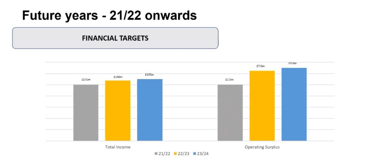 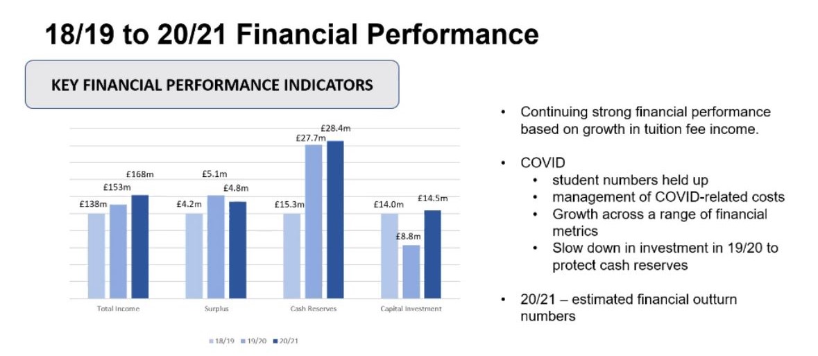 |
Here are two graphics from a high-level presentation. Note how there is no scale on either graphic as each of the bar charts has differing scales! Questions that should be asked include: What determined the scale of each bar chart? Is there a true zero on any of the charts? Are the different scales on each chart exaggerating or minimising differences in the columns? |